YouTube Foundational Design System
Date:
Mar 9, 2025
Client:
YouTube
Role:
UX Designer + Writer
Background
YouTube designers needed a definitive source of best practices to globalize all base components across the YouTube experience.
My team at Advanced Systems Group (ASG) was tasked with developing a comprehensive collection of all guidelines and standards for the YouTube Design System. Our job was to establish unity and order in an ever-evolving product space. This foundation would support continuous additions and modifications and act as a living, breathing guide for all designers.
Goal
Streamline dynamic and complex greenlines for the average designer; all while building systematic rules from the ground up.
My Evolving Role
Responsibilities
I handled copywriting, research, and strategy for accessibility content. In between content drafting, information architecture, and weekly correspondences with our team's accessibility liason, I designed 200+ assets for the final website.
Taking Initiative
The ASG design team navigated major transitions coinciding with our YouTube partner's growing concern about asset alignment. As the designer on the project the longest (and despite holding a Junior UX Designer title at the time), I stepped up to stabilize both the workflow and client relationship. After losing our lead UX Designer, I became the primary point of continuity and guided our incoming designer through the product’s complex historical context while reviving our client dialog.
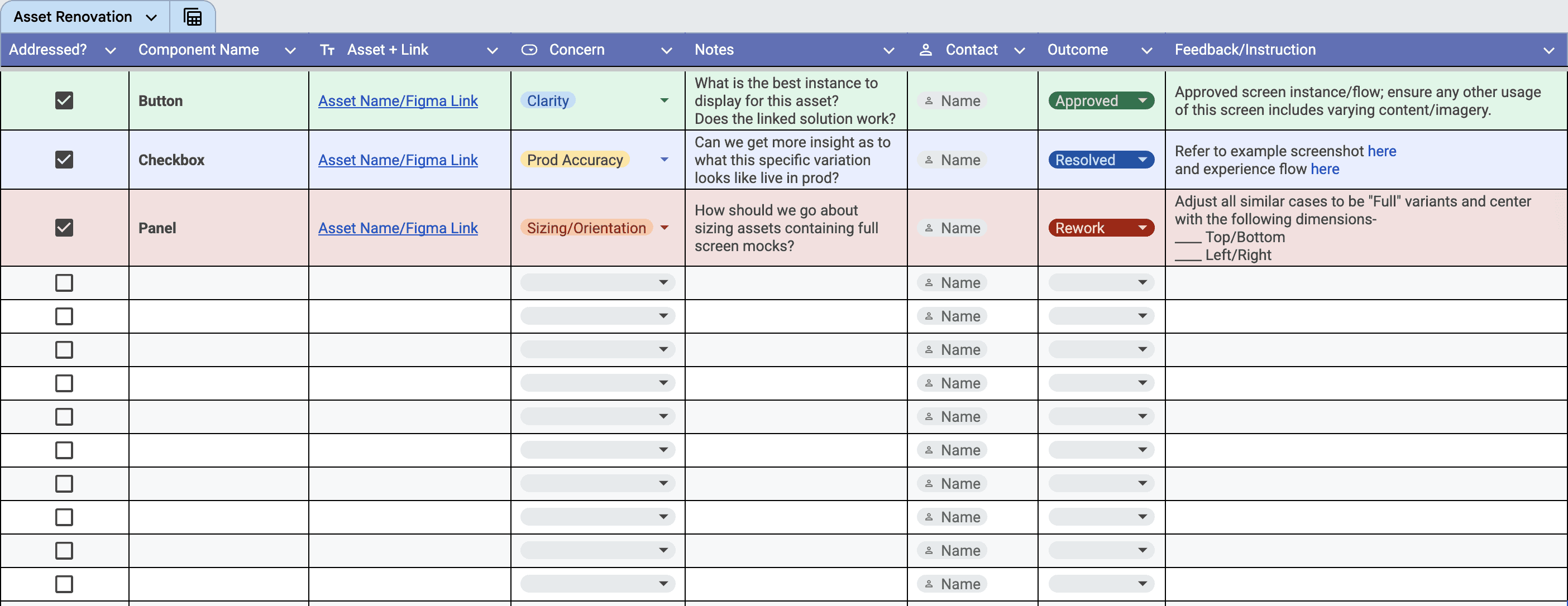
Our waterfall-style cadence limited communication and slowed reviews, so I helped implement a more agile, collaborative workflow with daily touchpoints. These sessions guaranteed regular visibility for content accuracy, which is critical for a design system site with detail-sensitive components. I even developed a structured tracking system to organize blockers, consolidate clarifications, and streamline the feedback cycle.
The client praised our work, raving that our output exceeded their initial expectations and achieved more in a couple of weeks than in the previous months. My proactive communication, organized leadership, and cross-team alignment established a strong partnership and set a foundation that carried the project forward with renewed confidence.
Initial Obstacles
We joined the project after YouTube design teams had developed a working + experiential understanding of DO's and DON'Ts. That's to say, if a design system is a railroad that guides our product design trains, we already had some sporadic tracks laid here and there.
I had to connect the dots and investigate various documents of existing standards and requirements; consequently played a key role in establishing an exhaustive design system.
Once I determined the appropriate and accurate parameters for Mobile foundational design, I had to communicate complex rulings, reasoning, examples, and exceptions in an accessible and clear fashion.
Understanding My Users
I made a conscious effort to consider our users from all walks of life. Our website was for YouTube designers, but I wanted to account for all levels of experience, clearance, and access.
It was important to begin our production by understanding the answer to the following question: Where do our designers run into confusion? My first order of business was to conduct a deep dive on our target audience by working with our client to identify bottlenecks facing designers across the platform. We prioritized standards that addressed recurrent areas of uncertainty.
However, we needed the full picture. So, I put my investigative and research experience to the test by examining the precise functions and variations of each component in the live mobile app. I cross-referenced my findings with the asset library on Figma, noting any discrepancies. This was the most defining part of our partnership- building answers to questions designers didn't know they didn't know. Highlighting the obscure accessibility edge cases promotes informed experience design.
Content Creation
Copwriting
My accessibility content emulated the structure of the existing Google Material (GM3) model.
I formulated a tone and language tailored to our demographic- other designers. This required an intentionally approachable and universal voice to reach designers from any background. I implemented formulaic language to create consistency and manage user expectations. Reusing standard phrasing in adjacent component pages formed tangible connections between ideas for our team and our audience.
Strategy
Beyond my content writing work, I had to consider these pages in the context of our project scope and anticipate future design system updates. I worked as the sole channel between our accessibility advisor and the rest of the team. Together, we identified the essential accessibility criteria required for our launch.
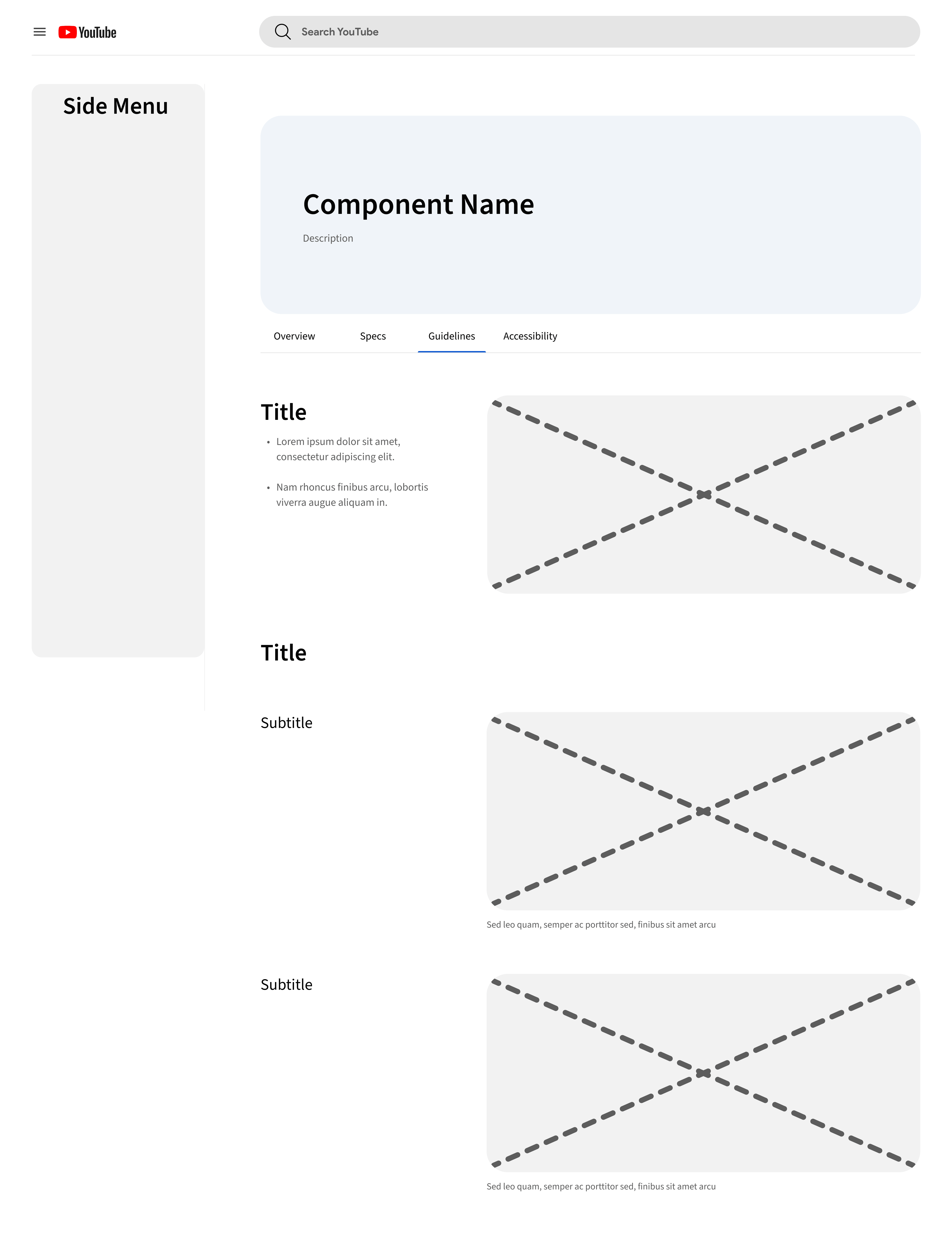
Information Architecture
I refined our page structure and hierarchy template to depict component nuance and application variations dependent on use cases. Functionality is not universal among all components, so I built a flow honoring these details with an overarching information architecture and nested sub-hierarchies.
Asset Production
I remained the major contributor and lead of all asset development in the face of personnel shifts and content expansion. We quickly produced over 400 individual assets exceeding our client's expectations and facilitated numerous revisions all within record time.
Outside of producing hundreds of mocks, I orchestrated many resolutions when troubleshooting design hurdles. My work stood out with its prompt completion and problem-solving ideations. I tend to view blockers from various angels, and I made a habit of posing solutions with every flag I raised.
Some of my design mitigations included:
Component transfer techniques
Element framing solutions
Simplifying sizing mechanics
Consolidating asset blockers and specifications
Streamlining multi-frame asset exports

Outcome
The final launch was met with praise, and most importantly, gratitude. Not only were designers relieved of navigating ambiguity, but they were also given an adaptive and concrete structure to build upon.
Our team delivered a sleek and intuitive design system website ripe for templating unique product design standards across the YouTube experience. Designers will rely on my asset tracking spreadsheet and instructional records chronicling our process to expedite component documentation, standards, and accessibility requirements.
Reflection
This project honed what I believe to be the most powerful skill in design- adaptability.
I approach all my work with the ambition to reform flows and experiences for as many people as possible. My job is to anticipate, identify, and resolve problems. The beauty of design is that it's an art of endless learning with constant breakthroughs and evolution. This production process threw me into the deep end and taught me the agility and diligence I needed to withstand countless changes. To my surprise, I emerged a stronger leader and self-reliant designer unafraid to traverse unpredictable and treacherous conditions.